
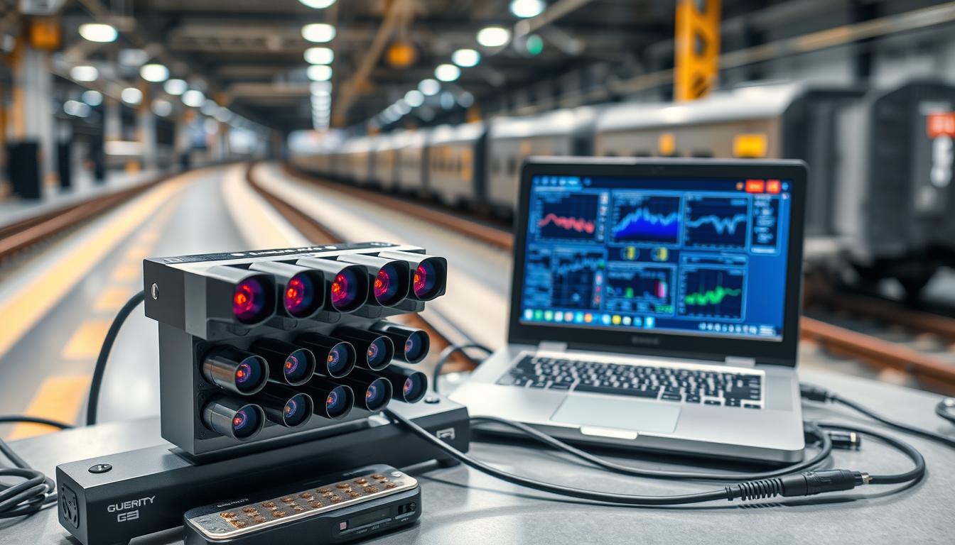
Ever seen a model train experiment go wrong because a sensor read “light” when it should have read “time”? I have. It’s a common problem of bad data leading to bad conclusions. You start with a great question, but poor data logging ruins your conclusion.
We’ve all been in this situation. You’re not just collecting numbers; you’re collecting a story. The raw voltage from an IR gate is just a number. But the real story is how that number changes and what it tells us.
This is the main challenge: wanting clean, pure data but facing the messy real world. Your sensors and IR gate timers are key witnesses. If their testimony is wrong, your whole case falls apart. Good logging is the base for all graphing and analysis.
Think of it as detective work. The data points are clues. Your job is to connect them, find patterns, and present a clear case. The first step is making sure your evidence—your raw data—is perfect. Everything else, from graphing to presenting, depends on it.
Choosing Your Data Arsenal: Stopwatch, IR Gate, or App?
Your data’s quality depends on the tool you use to collect it. Before you start, you must pick how to get the raw numbers. This choice is not just about gadgets; it’s about selecting the right observer for your study. You might choose the classic stopwatch, the precise IR gate sensor, or the versatile smartphone app. Each option affects your data’s accuracy, your experiment’s ease, and the story your data tells.
The Sensor, The Stopwatch, and The Smartphone
Think of your data collection method as a character in your experiment’s story. Each tool has its own strengths and weaknesses. You need to pick the right one for your specific experiment.
Let’s look at the contenders. We have the classic stopwatch, the precise IR gate sensor, and the smartphone app. The best tool for you depends on your experiment’s needs, not just its features.
| Tool | Best For | Key Advantage | Key Limitation | Ideal For The Scientist Who… |
|---|---|---|---|---|
| Analog Stopwatch | Simple timing tasks, human-observed events, low-budget setups. | Simple, cheap, and requires no batteries beyond your thumb. | Human reaction time adds ±0.2s error; impossible for sub-second events. | Wants to understand the absolute basics and doesn’t mind a ±5% margin of error. |
| IR Gate Sensor | High-precision timing (to 0.001s), start/finish lines, projectile speed. | Unbeatable, objective precision; removes human error. | Higher cost, setup time, and can be fussy about alignment and lighting. | Needs lab-grade data or is measuring events too fast for human reflexes. |
| Smartphone App | Multi-sensor data (video, audio, accelerometer), field work, multi-tool needs. | Leverages existing hardware; can log multiple data streams (video, sound, time). | Can be overkill for simple tasks; app quality varies wildly; a “Jack of all trades.” | Wants an all-in-one solution and values convenience and multi-functionality. |
The stopwatch is like a pocket knife for timing: reliable and simple. But, it’s not perfect because it’s controlled by you. Human error can mess up your measurements, like timing a 100m dash or a pendulum swing.
The IR gate sensor is the opposite. It’s precise and doesn’t rely on human timing. It’s perfect for when you need exact measurements, like knowing when Object A passed point B at 1.047 seconds.
The smartphone is like a Swiss Army knife. It can do many things, like track motion, time echoes, and log g-forces. It’s great for collecting lots of data, but it can also get distracted by notifications.
Choosing your tool is about matching its strengths to your question. For simple tasks, a stopwatch might be enough. But for precise measurements, like a rolling ball’s acceleration, the IR gate is better. Your smartphone can do both, but it might not be as precise as the IR gate. Pick the tool that captures the truth you need.
Structuring Your Data Table: The Blueprint for Insight
A messy data table is like wearing sweatpants to a fancy event. It messes up everything you’re trying to do. Your table is more than just a place for numbers. It’s the key to finding patterns or hiding them.
Think of it like this: high-level AI models use “log event count matrices” and “graph structures.” Your experiment needs the same careful planning. Your data table is like a node list, and the connections you find are the edges. Without a clean setup, you’re lost, like trying to build IKEA furniture without instructions.

Now, the real work starts. You’re turning raw data into organized insights. It’s like the third source’s metaphor about “extracting and shaping data from transcripts.” You’re not just recording; you’re building a structure.
Variables, Units, and the Sacredness of Trials
Let’s talk about the main characters in your experiment’s story. Mixing them up is a disaster.
The Independent Variable is what you change on purpose. This could be track length or starting height. It’s your main character, whose journey you’re documenting.
The Dependent Variable changes in response. This could be final speed or acceleration. It’s the character that changes because of the plot.
The Controlled Variables are kept the same. These are your supporting cast, keeping things consistent. They make your story believable.
Now, about units. Mixing different units in the same column is a crime. Choose one system and stick to it. Your future self will thank you when analyzing the data at 2 AM.
Here’s your blueprint for spreadsheets:
- Column A: Trial Number (1, 2, 3… because order matters)
- Column B: Independent Variable with clear units (Track Length [cm])
- Column C: Dependent Variable with clear units (Final Speed [m/s])
- Column D-F: Controlled Variables (Train Mass [g], Track Angle [°], etc.)
- Column G: Notes (That weird wobble on trial 3? Write it down!)
Trials are sacred. You need at least three, but five is better. One trial is just a story, not data. It’s the difference between a fluke and a finding.
Each trial should be its own row, a complete story. Don’t average as you go. Record raw data faithfully. Modern spreadsheets let you calculate averages in separate columns, keeping the original data safe.
Remember: your table is the first draft of your experiment’s biography. Give it clear headings, consistent units, and enough trials to tell a meaningful story. Unlabeled columns lead to confusion, and mixed units cause errors.
When your data table is structured, magic happens. Patterns emerge, and relationships become clear. That messy collection of numbers becomes a blueprint for insight, waiting for you to discover it.
Creating Clean, Compelling Graphs
Most scientific graphs look like they were made in the 90s. They’re messy and hard to understand. A good graph is like a strong argument, showing your data clearly.
Removing unnecessary details is key. A clean graph stands out, while a messy one gets lost in data. Let’s make our graphs beautiful and meaningful.
Titles, Labels, and the Truth About Error Bars
Forget fancy effects and colors. They distract from the data. A good graph is clear and easy to get.
To make a scatter plot that tells a story, focus on three things: title, labels, and error bars.
1. The Title: Tell a Story, Not Just a Name
Your title should tell the story, not just list variables. Instead of “Time vs. Distance,” say “Train Distance Traveled Over Time.” This makes it clear what your graph is about.
2. Axis Labels: The “What” and “How Much”
Axis labels explain what each axis is. “Time (s)” is good, but “Time Elapsed (seconds)” is better. Make them clear and easy to read.
3. Error Bars: The Honesty Bars
Error bars show how sure you are about your data. They’re not just for looks. They tell you the data’s range. Don’t ignore them.
The table below shows what makes a graph good. It’s like a checklist before you show your graph.
| Graph Element | The “Chartjunk” Trap | The Sage’s Clean Solution |
|---|---|---|
| Title | “Figure 1: Results” | “Figure 1: Velocity of a Model Train vs. Incline Angle” |
| Axis Labels | “X” and “Y” or, worse, “Variable A” | “Time Elapsed (s)” and “Distance Traveled (m)” |
| Data Points | Cluttered, overlapping symbols that obscure the trend. | Clear, distinct markers (circles, squares) with a size and color that ensures visibility. |
| Error Bars | Missing, or inconsistent (e.g., only on some points). | Present on all relevant data points, with a clear legend explaining what they represent (e.g., ±1 SD). |
| Trendline | A “best-fit” line forced through every data point, regardless of fit. | A clear, uncluttered line of best fit, with its equation and R² value displayed if the story is the trend. |
A great graph tells a complete story. The title introduces the topic, labels explain the data, and error bars show the uncertainty. Avoid unnecessary details. Your goal is to show the truth in your data.
The Art and Science of the Trendline
A trendline is more than a squiggle on a graph; it’s your data’s best attempt at telling a coherent story. It’s like the main theme in a novel or the central melody in a symphony. Your raw data points are the individual notes or words—full of life but chaotic on their own.
The act of drawing a trendline is a fundamental act of science: you’re fitting a model. This is the same principle used by fancy “anomaly detection” algorithms. They establish a model of “normal” and flag anything that deviates. Your experiment is simpler, but the goal is identical. You’re asking, “What is the underlying pattern here?”
Linear, Quadratic, and Knowing the Difference
Let’s be honest, most graphing software gives you a dropdown menu of trendline options that looks like a math professor’s fever dream. Don’t panic. You only need to understand two for 90% of your work: the straight shooter and the gentle curver.
Choosing the right one isn’t about what looks coolest. It’s about what story your data implies.
- The Linear Trendline (The Straight Street): This is your default. It assumes a constant rate of change. If you increase your independent variable by 1, the dependent variable changes by a fixed amount. It’s a one-way street with no turns. When your data points roughly follow this straight path, the linear model is your best fit. It tells a simple, powerful story: “As this goes up, that goes up (or down) at a steady pace.”
- The Quadratic Trendline (The Mountain Road): This line curves. It models relationships where the rate of change itself is changing. Think of acceleration—speed doesn’t increase steadily, it increases faster over time. A quadratic trendline is like a road curving up a mountainside. Use it when your data clearly arcs, suggesting a peak or a valley within your measured range.
Now, a word of caution from your sage guide. That dropdown menu might also offer “Polynomial (Order 6)” or other wiggly options. Just because you can make a line dance through every single data point doesn’t mean you should. That’s called overfitting. It’s like crafting a story so specific to today’s weather that it makes no sense tomorrow. A good model captures the general trend, not the random noise.
The true art lies in selecting the simplest model that tells your data’s truth. The best fit isn’t about a perfect fit. It’s about the most honest and useful story.
Demystifying R² and Residuals: The Good, the Bad, and the Ugly Fit
So, you’ve plotted your data and drawn a beautiful trendline. Your graph looks sharp. But how do you know if your line is telling the truth or just flattering you? The secret lies in the story of the points that got away.
The two main characters in this story are the R-squared value and the residuals. They tell you if your line is honest or not.
Think of your data as a person and your trendline as a suit you’re tailoring for them. The goal is a well-fitted suit, not too tight or too loose. The R-squared value is like the tailor’s confidence score. It shows how well the suit fits the person on average.
The Truth Behind the “Goodness of Fit”
An R² of 0.95 is like a bespoke suit from Savile Row—it fits perfectly. The data points and the trendline are in harmony. An R² of 0.3 is like a suit off the rack—it’s the right shape but not perfect.
The number itself is the tailor’s confidence that the suit pattern works for others. It’s a measure of the trendline’s “transferability.”
The residuals are the tailor’s “regrets.” They show specific misfits. If R² is the tailor’s confidence, the residuals are his post-fitting notes.
Imagine plotting all your data and drawing your best-fit line. For each data point, draw a vertical line to the trendline. This vertical distance is the residual for that point.
A residual plot shows how well the fit is. If the points are scattered randomly, you’ve got a good fit. The suit isn’t perfect, but its flaws are random.
But if the residuals show a pattern, your suit is the wrong cut. It’s like a few random tugs versus a systematic problem. A high R² with a clean residual plot is a master tailor. A high R² with a patterned residual plot is a master of deception.
The goal isn’t a perfect R² of 1.0. A perfect fit is unrealistic. The goal is a good fit, finding the honest trend in the data. The residuals are key to hearing what the data is really saying.
Building a One-Page Research Poster: From Data to Narrative
Think of your research poster as a trailer for your experiment’s story. It’s a summary that grabs, explains, and convinces in under a minute. It’s not just a graph; it’s a visual guide through your scientific journey.
A well-crafted poster is a narrative arc built on a solid methods-results-claims trifecta. Forget the wall of text and endless bullet points. Your audience needs to understand the what, how, and so what quickly.

The Methods-Results-Claims Trifecta
This isn’t just a storytelling trick. The Methods-Results-Discussion structure of a paper is a story for a reason. Your poster should follow a similar, streamlined trifecta. This is your “context graph”—a single snapshot of your experiment’s entire knowledge graph, from hypothesis to conclusion.
Act I: The Methods (Our Hero’s Toolkit)
This is your “Once upon a time.” Start with a clear, concise hypothesis. Then, in a few bullet points or a simple diagram, show how you gathered your evidence. Did you use a high-speed camera and a 3D-printed track? A specific sensor array?
This isn’t a lab manual; it’s the “how” of your detective story. Be specific but succinct. Think of it as the “setup” in a heist movie—this is where you show the team and the plan.
Act II: The Results (The Big Reveal)
This is your “they discovered that…” moment. Here, your clean, compelling graphs and charts are the stars. But remember, a graph without a clear takeaway is just a pretty picture.
Each chart should scream (or at least, clearly whisper) its point. This is where you present the evidence, the raw data of your scientific tale. Use your clean, labeled graphs from earlier sections. The key is visual clarity over visual clutter.
Act III: The Claims (The Moral of the Story)
This is your “And so we learned…” moment. What does the data mean? This section is your punchline. It’s not enough to say “the data shows a trend.” Your claim is your conclusion, the “so what?” of your entire experiment.
Did the data support your hypothesis? If not, what does the anomaly tell you? This is your chance to explain any deviations—your “anomaly explanation,” which adds depth and scientific rigor, not doubt.
To make this trifecta work, structure your poster with these distinct, labeled sections. Guide the viewer’s eye logically through your scientific narrative.
Your Poster as a Visual Storyboard
Think of your poster as a static “context graph” for your experiment. Each section is a node:
- The Hypothesis Node: The question we started with.
- The Methods Node: The tools and path we took.
- The Results Node: The evidence we collected.
- The Claims Node: The meaning we derived.
The connections between these nodes form the narrative. A good poster makes these connections visually intuitive.
From Data Dump to Data Narrative: A Checklist
Before you print, run your poster by this quick peer-review checklist:
- Clarity: Can a non-expert grasp the core question and finding in 30 seconds?
- Flow: Does the eye move naturally from hypothesis to conclusion?
- Visual Hierarchy: Is the most important data (your claim) the most prominent?
- Anomaly Explanation: Did you address any data that didn’t fit? This shows scientific rigor.
- The “So What?”: Is the “why this matters” clear and prominent?
Ultimately, a great research poster is a visual executive summary. It transforms your data from a spreadsheet into a story, your experiment from a procedure into a narrative, and your claims from a hypothesis into a conclusion. It’s not just about presenting data; it’s about making it matter.
Common Graphing Sins and How to Atone
Most bad graphs aren’t made with bad intentions. They come from a lack of care for the viewer’s sanity. In science, a misleading graph is a crime against clear communication.
Your aim is to tell one clear story, not overwhelm with too much information. Let’s confess to these visual sins.
The 7 Deadly Sins of Data Visualization
This is your guide to making amends. Each sin breaks a rule of honest data display. The fix is usually simple.
| The Sin | The Crime Scene | The Atonement (The Clean Graph) |
|---|---|---|
| The Unlabeled Axis | A graph with mysterious, nameless dimensions. Is the Y-axis speed? Time? Happiness? The viewer is left guessing. | Always, always label both axes with the variable name and its units (e.g., “Speed (m/s)”). This is a cardinal rule. |
| The Misleading Y-Axis | Starting the Y-axis at a number other than zero to exaggerate a tiny trend. A 1% change looks like a mountain. | Unless you have a very good reason, start your Y-axis at zero. It’s the foundation of honest scaling. |
| The 3D Pie Chart | A war crime against data. Distorted perspectives make slices impossible to compare. It adds pure “chartjunk.” | Use a simple 2D pie chart for few categories, or better yet, a bar chart. Let the data speak, not the graphics engine. |
| The Rainbow Explosion | Using a dozen clashing colors for no reason. It’s visually noisy and often meaningless. | Use a consistent, accessible color palette. Differentiate only what needs differentiating. Subtlety is a virtue. |
| The Missing Context | A graph floating in space with no title or caption. What experiment does this represent? Who knows? | Give every graph a descriptive title. A brief caption explaining the “so what” is the final piece of the narrative. |
| The Overcrowded Plot | Five trendlines, two data sets, and a partridge in a pear tree on one graph. Information overload. | One key relationship per graph. If you must compare, make it clean and legible. Less is almost always more. |
| The Forgotten Error Bar | Presenting a single data point as absolute truth, hiding the natural variation in your measurements. | For experimental data, error bars are non-optional. They show the precision of your work and tell the real story. |
Do you see a pattern? The fix is always simple. It’s about clarity, honesty, and focus. A clean graph respects the audience’s time and intelligence.
Committing these graphing sins doesn’t just make your work look sloppy. It hides your discovery. In a train experiment, a mis-scaled axis could hide a real relationship between track slope and speed.
The goal of data visualization is enlightenment, not decoration. By avoiding these common pitfalls, you move from creating mere charts to crafting compelling evidence. Your data deserves nothing less.
Your Toolkit: Templates and a Peer Review Checklist
You’ve logged the data and built the graph. Now, it’s time to present with clarity and confidence. Every great communicator needs a solid plan and the right tools. This is your starting point.
Download the Template
Stop making data tables from scratch. Our template spreadsheet has the structure you need. It has cells for variables, units, and multiple trials. A one-page poster template turns your analysis into a compelling story. Think of it as your scientific story’s blueprint. Download it and customize it.
The Peer Review Checklist
Before you present, check your work with our peer review checklist. It’s your pre-flight check. Does your graph have a clear title and labeled axes? Are your error bars honest? Does your trendline make sense mathematically? This checklist tests if your presentation is ready for scrutiny.
Your journey from raw numbers to clear insight is complete. You’re no longer just a data collector. You’re a data communicator. With this toolkit, your methodology is solid. Your analysis is sharp. Your presentation is ready. Go, graph, and conquer.
