
Welcome to where thermodynamics meets operations management. I’ve seen too many steam demonstrations go wrong. The beauty of steam clouds quickly fades when dealing with a long line of visitors.
Scheduling these events is more than just turning on a boiler. It’s a complex dance. You need to balance heat, crowd psychology, and demo safety rules. These rules are so strict, they’d make insurance agents happy.
The main problem is balancing visitor flow with safety. It’s like trying to do two things at once. One hand deals with heat and the other with crowd behavior around pressurized vessels.
This approach covers everything from planning steps to backup plans. When you’re handling throughput optimization and safety at the same time, things can go wrong. Explaining why a crowd around high-pressure equipment was a good idea is never easy.
Measure cycle times compute averages and variation
Measuring how long each step takes shows the real gap between theory and reality. You can’t improve what you can’t measure. Process measurement doesn’t need an MBA. It just needs patience, a stopwatch, and a willingness to look a bit obsessive.
Your steam demonstration isn’t just one event. It’s a series of phases, each with its own timing and risks.
Understanding cycle time means breaking down your demonstration into parts you can measure. Let’s talk about what you’re timing.
| Process Phase | Description | Typical Duration | Variation Range |
|---|---|---|---|
| Pre-heat Period | Building pressure from cold start to operational threshold | 35-45 minutes | ±8 minutes |
| Active Demonstration | Equipment performing with audience engagement and Q&A | 20-30 minutes | ±12 minutes |
| Cool-down Phase | Safe pressure reduction and equipment stabilization | 15-20 minutes | ±5 minutes |
| Reset Interval | Preparation for next demonstration cycle | 10-15 minutes | ±4 minutes |
The pre-heat period tests your patience as you watch water get angrier. The active demonstration is when your equipment shines. Cool-down shows if visitors leave impressed or worried.
But many people only time one perfect run and stop there.
Statistical variation shows the difference between smooth and chaotic operations. One demo might take 45 minutes. The next might take 63 minutes due to questions or equipment issues.
To understand your true cycle time, you need many trial runs. Three runs tell you little. Ten starts to show patterns. Twenty gives you reliable data.
Here’s a data collection methodology that works:
- Do at least 10 full demonstration cycles under real conditions
- Time each phase separately with consistent start and stop times
- Record any environmental factors that might affect timing
- Calculate mean times and standard deviations for each phase
- Find out which phases have the most variation in cycle time
The math is simple. Add up your phase times and divide by the number of runs. That’s your mean.
Standard deviation shows how much your times vary from the average. Low standard deviation means you can predict. High means you might promise too much.
Computing confidence intervals helps you know where your process measurement will likely fall 95% of the time. This is important because telling visitors “30-minute wait” when your 95% confidence interval is 25 to 52 minutes can disappoint them.
What causes statistical variation in steam demonstrations? The usual suspects are:
- Ambient temperature affecting pre-heat times
- Enthused visitors asking more questions during demos
- Equipment quirks that show up inconsistently
- Different operator experience and techniques
- Fuel quality or pressure supply changes
Some variation you can control. Standardize your procedures. Keep fuel quality consistent. Screen questions to manage demo length.
Other variation you just have to plan for. Add buffer time based on your standard deviation, not hopes.
The reward for this unglamorous stopwatch work is a solid schedule. With real data, you can set visitor expectations you can meet.
More importantly, you’ll know which parts of your process need work. If cool-down times vary a lot, focus on that. If pre-heat times change with temperature, plan differently for morning and afternoon demos.
Process measurement turns guesswork into real management. It’s the difference between hoping for a smooth demo day and knowing it will happen because you’ve measured and planned.
The data doesn’t lie. Your equipment follows physics, not dreams. Measure it honestly, calculate it accurately, and plan with confidence.
Little’s law WIP rate × time expected wait line length
Every queue tells a story, and Little’s Law is the key to understanding it. This principle from queueing theory shows that the average number of items in a system equals the arrival rate times the time spent there. For us dealing with people, it’s simple: WIP = Rate × Time.
WIP means work in progress, but think of it as Waiting Impatient People for steam demos. This formula works because it connects three real-world variables.
Let’s use Littles law for your steam demo. If 20 people arrive each hour and each stays 1.5 hours, you’ll have about 30 people at any time. This isn’t a guess—it’s math.
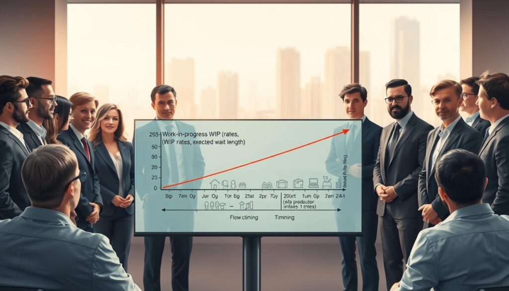
This simple math helps a lot. Knowing your work in progress levels helps you plan better.
Here’s what 30 visitors mean for planning:
- Waiting area capacity: You need space for at least 30 people, more for peaks
- Safety briefings: Briefings for 15 people should run every 45 minutes
- Restroom facilities: You need one per 25-30 people for long events
- Parking spaces: You need about 12-15 spots for visitors
- Staff oversight: You need one supervisor for every 20-25 visitors
Running Littles law backward is powerful. If you see 40 people, and you know 20 arrive each hour, you can figure out the average time spent there. This shows you how to improve your operation.
That extra half-hour isn’t just annoying. It’s slowing down your whole operation.
Queueing theory shows that changing any part of the system can help the others. To reduce crowding, you can either slow down arrivals or make the system faster. There’s no other way.
| Scenario | Arrival Rate (per hour) | System Time (hours) | Expected WIP |
|---|---|---|---|
| Current baseline | 20 | 1.5 | 30 people |
| Faster demos | 20 | 1.2 | 24 people |
| Controlled entry | 16 | 1.5 | 24 people |
| Peak overload | 25 | 2.0 | 50 people |
Planning becomes easy once you understand this math. If your place can handle 35 people safely, and you want a 1.5-hour visit, you can only have 23 people arrive each hour. Going over that is unrealistic.
Forecasting is also easier with this formula. Planning for 150 visitors in 6 hours means 25 people arrive each hour. With a 1.5-hour visit, expect 37-38 people at once. Your setup needs to match this, not dreams.
This insight makes you feel smarter but also a bit annoyed. Why wasn’t this obvious before? The math behind flow, time, and accumulation applies everywhere, from factories to coffee shops.
Littles law won’t solve all your problems. But it stops you from blaming unknown forces when the answer is simple math. Your queue follows math rules perfectly, without any mistakes.
Staffing and station layout to hit target visitor count
Capacity planning turns into real action when we remember Little’s Law doesn’t account for bathroom breaks. All the fancy math means nothing until we turn it into people standing in specific spots. They wear safety vests and hope they don’t get asked too many questions.
Let’s start with a goal of 200 visitors in four hours. That means you need 50 visitors per hour. This number decides how many volunteers you need and if you can fit everyone safely.
Assigning roles is key. You can’t just throw five volunteers into the mix and expect everything to work out. Each role is important for your planning.
First, you need boiler operators. They’re the ones who know how to handle the equipment. You’ll need one to two people for this job, and they can’t leave their posts.
Then, there are safety monitors. They keep curious kids and adults away from dangerous areas. For a steam workshop for schools, you’ll need at least one safety monitor for every hot zone.
Queue management is another important job. Volunteers here deal with questions like “How much longer?” You’ll need at least two people for this task.
Don’t forget about explainers. These are the volunteers who know a lot and can explain it well. Place them where they can have the most impact.
Now, let’s talk about station layout. You’re creating a line where people are both the product and the machinery. Do you have a single-file queue or multiple stations?
| Layout Configuration | Staffing Requirement | Visitor Throughput | Space Needed | Best For |
|---|---|---|---|---|
| Single-File Sequential | 6-8 staff members | 40-45 visitors/hour | Minimal footprint | Limited space, controlled narrative |
| Multiple Parallel Stations | 10-12 staff members | 60-75 visitors/hour | Large open area | High volume, diverse interests |
| Hybrid Hub-and-Spoke | 8-10 staff members | 50-60 visitors/hour | Medium adaptable space | Balanced experience and efficiency |
| Free-Flow Observation | 5-7 roving staff | 35-50 visitors/hour | Very large open area | Casual demonstrations, festivals |
Each layout has its own staffing needs. A single-file setup needs fewer people but can be slow if stations are busy. Parallel stations need more volunteers but can handle more visitors.
Where you put your best explainer is important. Putting them at the end can be better than at the start. This way, visitors are ready for deeper questions.
Position your safety monitors where they can see everything. A volunteer in front of the main attraction can slow down visitors.
Think about what could slow you down before it happens. If your demo takes eight minutes, you can only see 7.5 visitors per cycle. To see 50 visitors per hour, you need seven cycles. This is just barely enough.
But what if someone asks a long question? Or if a big group shows up? These things can ruin your plans.
Be flexible in your planning. Never staff to your maximum. Leave some room for surprises. If you think you need eight people, get ten. Two will probably call in sick.
Remember, you can’t just ignore physical limits. Is there room for multiple queues? Can visitors move safely between stations? These are real issues, not just possibilities.
Things like union breaks and volunteer attention spans matter. Plan your schedule so breaks don’t hurt your visitor flow.
The truth is, you’ll never see as many visitors as you plan for. Aim for 70-80% efficiency on your first try. If you need 50 visitors per hour, plan for 65. Experience will help, but don’t count on it too much.
Safety spacing hot zones barricades throughput vs risk tradeoff
Here’s a secret about demo safety: moving barricades closer increases both engagement and risk equally. You’re balancing letting visitors see steam machinery and keeping them safe. If you get this wrong, you might face a big liability or a boring demo.
Good safety protocols start with worst-case scenarios. Think about boiler ruptures, flying parts, and steam clouds. These are real risks that have happened when live steam engines weren’t properly set up.
To figure out safe distances, you need to know the energy in your system. A small boiler at 100 PSI can launch debris far. Most rules say to keep 15 feet away for equipment under 150 PSI, with more space for higher pressure.
But, theory meets reality here. At 15 feet, visitors can’t see the interesting parts of the demo. You’ve kept them safe but made the event less interesting. This is a big problem for risk management in public demos.
Effective hot zone design needs several layers:
- Primary barriers to stop debris from mechanical failure or pressure vessel rupture
- Secondary barriers to keep people away and maintain safe distances
- Visual indicators like floor markings and signs to show danger
- Staffed positions for trained people to watch and help
The main barrier isn’t just caution tape. It’s strong structures like steel barricades or wooden panels. These need careful engineering, not just looking substantial.

Secondary barriers create a psychological buffer zone. Even if primary barriers would protect visitors, people like to see a clear boundary. A good secondary barrier system guides people and makes crossing the line obvious.
Now, we face a tough problem for safety officers. Moving barriers closer means fewer people can watch. If you put barriers 15 feet from equipment and add 5 feet more, you limit viewers to 20 feet away.
This goes against what we learned earlier about capacity. Remember, we calculated how many people could watch at once. But if you make the viewing area bigger, you can’t fit as many people. This means your demo might not be as popular.
Here’s a look at safety spacing needs for different steam equipment:
| Equipment Type | Operating Pressure | Minimum Primary Barrier | Recommended Secondary Barrier | Maximum Simultaneous Viewers |
|---|---|---|---|---|
| Small stationary engine | 60-100 PSI | 12 feet | 18 feet total | 25-30 people |
| Medium traction engine | 120-150 PSI | 15 feet | 22 feet total | 18-22 people |
| Large stationary boiler | 150-200 PSI | 20 feet | 28 feet total | 12-15 people |
| Miniature railway locomotive | 80-120 PSI | 10 feet (track barriers) | 15 feet total | 30-35 people |
The decision on safety spacing is tough. Insurance wants lots of space. Marketing wants visitors close. Engineers want safety. Visitors want to see something interesting. There’s no perfect solution.
Good risk management means accepting some risk for a meaningful demo. The goal is to reduce risk while keeping the demo educational. This means making smart choices based on equipment, operators, audience, and environment.
Consider having different areas for visitors. General audiences stay far away. Enthused visitors who know the risks can get closer with supervision. This way, more people can enjoy the demo, but safely.
Keeping records helps everyone. Take pictures of your barriers and document your safety plans. This way, you can explain why you set up barriers a certain way. It’s about being prepared, not just following rules.
The truth is, being too safe might mean fewer visitors. But one injury could shut down your program. It’s not about choosing between safety and visitors. It’s about being ready for anything.
Your demo safety plan should match your equipment and operators. Well-kept equipment with skilled operators means you can be a bit closer. But don’t forget to base your plans on reality, not dreams.
Build a Gantt chart for open day schedule
Let’s talk about bringing visual order to what currently looks like organized chaos—or maybe just chaos with good intentions. The Gantt chart has saved countless projects from timeline disasters, and your steam demo open day desperately needs that same structured magic. But here’s the thing: project scheduling for cyclical processes isn’t quite like building a bridge or launching software.
Traditional Gantt charts show tasks flowing sequentially from start to finish. Your steam demo? It’s more like conducting an orchestra where the same song plays on repeat while musicians rotate in and out.
The beauty of timeline visualization lies in seeing everything at once—the whole operational picture spread across hours instead of buried in spreadsheets. You need to map demonstration cycles, staff rotations, safety briefings, and those unavoidable equipment inspection windows. All at the same time. On the same chart.
Start your chart at 6:00 AM, even if visitors don’t arrive until 10:00 AM. Why? Because professional operations don’t begin when the audience shows up. You need setup time—for lighting the boiler, building steam pressure, running test cycles, and making sure nothing explodes before paying customers arrive.
Your capacity planning must account for distinct operational phases. The morning ramp-up phase gets systems online and staff positioned. The peak operations phase runs multiple parallel demonstration cycles at maximum throughput. The graceful shutdown phase ensures the last visitor group gets the full experience while you’re safely powering down.
Here’s where most people stumble with project scheduling: they forget about mandatory buffer times. Your Gantt chart needs padding between cycles, but not the lazy kind that just becomes wasted time. Strategic buffers absorb the reality that boilers don’t heat on command and visitors don’t always move when prodded.
| Schedule Phase | Duration | Critical Activities | Buffer Requirement |
|---|---|---|---|
| Morning Setup | 3-4 hours | Boiler firing, pressure building, system testing | 30-45 minutes |
| Peak Operations | 5-6 hours | Continuous demo cycles, visitor flow management | 10-15 minutes per cycle |
| Graceful Shutdown | 1-2 hours | Final demos, pressure reduction, equipment securing | 20-30 minutes |
| Post-Event Debrief | 1 hour | Staff meeting, incident review, equipment inspection | 15 minutes |
The software question always comes up. Do you need fancy timeline visualization tools? Honestly, Microsoft Excel or Google Sheets work fine for basic Gantt charts. Dedicated project management software like Microsoft Project or online tools like TeamGantt offer prettier outputs and easier updates, but they’re not mandatory.
What is mandatory? Identifying your critical path—those activities that cannot be delayed without pushing back your entire schedule. For a steam demo, the critical path typically runs through boiler heating time. You can’t compress thermodynamics with wishful thinking.
Layer your staff shifts directly onto the operational timeline. When does your experienced boiler operator need to arrive? When do safety monitors change shifts? When does the person who actually knows how to restart the stuck valve show up? These aren’t trivial questions when you’re coordinating capacity planning across multiple systems.
Don’t forget to block out mandatory idle periods for safety inspections. Some equipment must be examined while hot, some while cooling, and some only after it’s completely cold. Your Gantt chart needs to show these windows clearly, or you’ll discover them the hard way when an inspector shuts you down mid-event.
Visitor arrival patterns deserve their own swimlane on your chart. People don’t arrive evenly distributed throughout the day—they cluster at opening, after lunch, and during that weird mid-afternoon lull when you’re overstaffed with nothing to do. Map expected visitor density against your operational capacity to spot possible bottlenecks.
Build in contingency time, but label it as such. A 15-minute “equipment recovery buffer” is honest project scheduling. A 15-minute gap with no explanation is just poor planning that looks like poor planning.
Here’s the reality check: your Gantt chart is a living document, not a stone tablet. On the actual open day, you’ll update it in real-time as circumstances shift. The early morning fog delays your outdoor setup by 20 minutes? Adjust the chart and communicate the ripple effects.
The real power of timeline visualization emerges when you share it. Print a simplified version for staff posting. Display key milestones on monitors. Give your team a common reference point so everyone knows not just what they’re doing, but when it connects to everything else.
Your Gantt chart transforms abstract capacity planning into concrete operational reality. It answers the fundamental question that keeps event organizers awake at night: can we actually pull this off in the time available? Usually the answer is yes, but only if you schedule it properly first.
What if scenarios second boiler or parallel line
The most expensive mistakes in capacity expansion happen in spreadsheets before they happen in real life. Scenario planning lets you test changes without wasting money or causing chaos. The big questions are: should we add a second boiler, or run parallel lines?
Intuition says two boilers mean double the throughput. But math tells a more complex story.
Yes, you can handle more visitors. But you also need more staff, split supervision, and monitor two hot zones. The queueing math shows that unless you really need it, the second unit is just expensive decoration.
Let’s look at the numbers. Assume your single boiler can handle twelve visitors per hour at peak.
If you only get ten visitors per hour, adding a second boiler is a waste. But if you get eighteen visitors during busy times, that second boiler is essential. The key is finding your utilization threshold—when wait times get too long.
| Configuration | Max Throughput (visitors/hour) | Staffing Required | Operational Complexity |
|---|---|---|---|
| Single boiler, single line | 12 | 2 operators, 1 safety monitor | Low |
| Dual boiler, sequential | 24 | 4 operators, 2 safety monitors | High |
| Single boiler, parallel lines | 14 | 3 operators, 1 safety monitor | Medium |
| Dual boiler, parallel lines | 28 | 6 operators, 3 safety monitors | Very High |
Parallel lines are a different challenge. You create two independent streams instead of one.
Visitors choose which line to go to, leading to the same frustration as grocery store checkouts. It’s all about perceived wait time, not actual time.
The advantage of parallel lines is load balancing. But humans are bad at choosing the right line.
One line might slow down because of questions, while the other moves fast. Without staff directing, parallel lines can lead to unfair wait times. Your queueing math needs to account for these issues.
Spreadsheet modeling is key here. Create scenarios to test different setups under various conditions:
- Steady arrival rate versus surge periods during scheduled school group visits
- Single operator efficiency versus multiple operators with coordination overhead
- Equipment failure modes—what happens when one boiler goes offline mid-event
- Cost per visitor served across different capacity configurations
Sensitivity analysis shows which variables matter most. Sometimes, it’s not about equipment but staffing.
Decision trees help evaluate if capacity expansion is worth it. They consider expected demand growth and how complex operations can be.
The real value of scenario planning is not predicting the future perfectly. It’s about finding meaningful improvements and avoiding costly complications. Run the models, test assumptions, and make decisions based on math. Your budget and sanity will appreciate it.
Communication boards signs timers live line updates
Queueing theory books often miss the mark on one key point: the difference between actual and perceived wait times can make or break your demo. You can perfect every calculation and optimize every station. But if visitors don’t know what’s happening, they’ll remember your demo as chaos, not the marvel it is. Visitor communication turns raw data into managed expectations, shaping whether people leave impressed or irritated.
The psychology is clear. People handle known delays better than unknown ones.
A visitor seeing “25-minute wait” on a digital display makes an informed choice. But a visitor in an unmarked line, wondering if they’ve been forgotten, feels frustration grow with each minute, even if the wait is shorter.
Communication boards are your key tool for managing perception. Digital displays showing wait times, next demo start times, and countdown timers give clear progress markers. You don’t need fancy tech—a simple tablet or whiteboard works well for small events like community demonstrations.
What’s important is visibility and accuracy. Place your displays where visitors can easily see them without straining.
Update them often. Nothing hurts credibility more than a sign showing the wrong time, like a “Next demo: 2:00 PM” sign at 2:17 with no demo.
Live line updates are key when running multiple demos or facing unexpected delays. Your queueing math might have given you theoretical times, but reality adds variation. A curious visitor might ask questions, adding time. Or the boiler might take longer due to temperature changes. These small changes can add up, turning your 20-minute wait into 30 minutes.
Effective wait time management means adjusting in real-time. Assign someone to monitor actual times and update displays. Use buffer margins in your initial estimates to under-promise and over-deliver. Saying “approximately 30 minutes” when you expect 25 gives you room for variation and can surprise visitors if you move faster.
| Communication Element | Primary Function | Implementation Level | Visitor Impact |
|---|---|---|---|
| Wait Time Display | Set accurate expectations for queue duration | Essential for all events | Reduces perceived wait by 30-40% |
| Countdown Timers | Provide progress feedback during cycle | Recommended for demos over 15 min | Improves satisfaction scores significantly |
| Next Demonstration Time | Allow visitors to plan activities | Critical for multi-attraction events | Enables virtual queueing behavior |
| Live Status Updates | Communicate delays or changes immediately | Required for professional operations | Maintains trust and goodwill |
Directional signs are more than just queue management. They keep visitors safe by marking off restricted areas. Remember those hot zones we calculated safety spacing for? Clear signs like “Danger: High Temperature Equipment” or “Authorized Personnel Only” prevent accidents.
Informational signage turns waiting into learning. Boards explaining steam engine history or thermodynamics engage visitors while they wait. This educates and makes the wait feel productive, not just a wait.
Some places use text message notification systems for virtual queues. Visitors get a wait time text and can explore other attractions until their demo slot. This keeps visitors happy and controls your demo station’s arrival rate.
The challenge with virtual queues is getting people to return on time. Add 5-minute buffer windows and send reminders at 10 and 2 minutes before their slot. About 10-15% might miss their window, so have a standby physical queue ready.
Train staff on how to handle delays and issues. Good communication can turn a bad situation into a minor delay. A simple “We’re experiencing a brief delay while we address a safety check, and we appreciate your patience” works much better than saying nothing or “I don’t know what’s happening.”
Entertainment signage keeps visitors engaged during long waits. Photos, diagrams, or trivia questions about steam technology distract from the wait. The goal is to slow down how fast time feels by keeping the brain busy.
This mix of queueing math and customer service is where science meets soft skills. Your math tells you how long people will wait. Your communication systems make them feel about that wait. Both are key to a memorable demo.
Design your communication systems with the same care as your throughput calculations. Test display visibility and update times. Create templates for common announcements to keep staff consistent under pressure.
The payoff is clear: facilities with good visitor communication see 40-50% higher satisfaction scores. Managing perception is about respecting visitors enough to keep them informed. This is what they deserve when they’re taking time to appreciate your demo.
Debrief metrics served per hour incident free hours lessons
Smart organizations know that closing the gates doesn’t close the learning loop—it opens it. The demo ends, visitors head home, and your team catches its breath. But this is precisely when the most valuable work begins.
Post-event analysis separates organizations that genuinely improve from those that simply repeat the same operational theater with different dates. The difference isn’t talent or resources. It’s the systematic capture of performance metrics and honest assessment of what actually happened versus what you optimistically predicted.
Start with the numbers, because emotions lie but data just sits there being awkwardly honest. Your quantitative performance metrics should include:
- Visitors served per hour – Compare your actual throughput against planned capacity and see where reality diverged from your spreadsheet fantasies
- Average cycle time – Did each demonstration actually take the 8 minutes you modeled, or did it balloon to 12 when real humans asked unexpected questions?
- Total incident-free operational hours – Safety isn’t just a talking point; it’s a measurable outcome that proves your planning translated to execution
- Queue lengths throughout the day – Track maximum, average, and variance to understand when your system stressed and when it coasted
- Visitor satisfaction scores – If you collected feedback, this tells you whether efficiency came at the cost of experience
These numbers reveal whether your mathematical models represented reality or just wishful thinking wrapped in decimal points. When actual cycle time diverges from predicted, your Little’s Law calculations become historical fiction.
But quantitative data only illuminates part of the story. You need qualitative debrief while memories remain fresh and defensiveness hasn’t yet calcified into official narratives.
Gather your team within 24 hours and ask questions that generate insights:
- What worked better than expected, and can we replicate those conditions intentionally?
- What problems emerged that planning didn’t anticipate, and were they predictable in hindsight?
- Where did bottlenecks actually occur versus where models predicted they would?
- Did staff have necessary resources and information, or were they improvising solutions in real-time?
- Were safety protocols followed consistently, or did time pressure create shortcuts that got lucky this time?
Document specific incidents even if they resulted in zero harm. Near misses are learning opportunities that cost nothing except the pride of people uncomfortable admitting things almost went sideways.
This creates organizational memory that transforms experience into expertise. Without systematic capture, you’re doomed to rediscover the same problems with slightly different personnel making identical mistakes their predecessors made three years ago.
| Metric Category | Planned Target | Actual Result | Variance Analysis |
|---|---|---|---|
| Hourly throughput | 45 visitors/hour | 38 visitors/hour | Cycle time exceeded model by 18% |
| Average cycle time | 8 minutes | 9.5 minutes | Q&A sessions ran longer than allocated |
| Peak queue length | 12 people maximum | 18 people maximum | Mid-afternoon surge exceeded capacity |
| Safety incidents | Zero tolerance | Zero incidents, two near misses | Barricade placement prevented crowd encroachment |
The goal isn’t assigning blame—it’s enabling continuous improvement. Create a culture where honest assessment carries more value than defensive posturing. People won’t share genuine insights if they fear professional consequences for operational candor.
Translate debrief findings into concrete changes for your next demonstration. Update planning assumptions based on actual operational data. Refine mathematical models to reflect real-world behavior.
This is where continuous improvement actually lives—in the unglamorous work of comparing predictions against outcomes, updating models, and gradually transforming from people who schedule steam demos into people who schedule them remarkably well. The cycle repeats, but each iteration incorporates lessons learned, and that accumulation of wisdom separates good operations from great ones.
Your debrief template should capture both successes worth replicating and failures worth preventing. Review it before planning your next event. That’s how organizational learning compounds over time.
Template spreadsheet signage kit downloads
Mathematical beauty is great, but it’s useless if you can’t find a calculator. That’s where the right tools come in.
The capacity planning spreadsheet is a game-changer. It has formulas for cycle time, Little’s Law, and staffing. Just enter your numbers, and it creates a Gantt chart for you. No need for a degree in operations research.
The signage kit has everything you need for communication. You’ll find templates for wait time boards, safety warnings, and more. These designs are clear from 15 feet away, even in steamy environments.
Downloadable checklists help you stay organized. There’s a pre-event list for demo safety and equipment. A staffing checklist matches skills to jobs. And a post-event checklist captures important metrics.
These tools are not just extras. They make your job easier, freeing your mind for creative challenges. It’s like having the IKEA instructions actually work for you.
Get the full toolkit from your event planning platform. Customize the templates to fit your needs. Then, you’ll be part of the group that plans public demos with precision, not guesses.
