
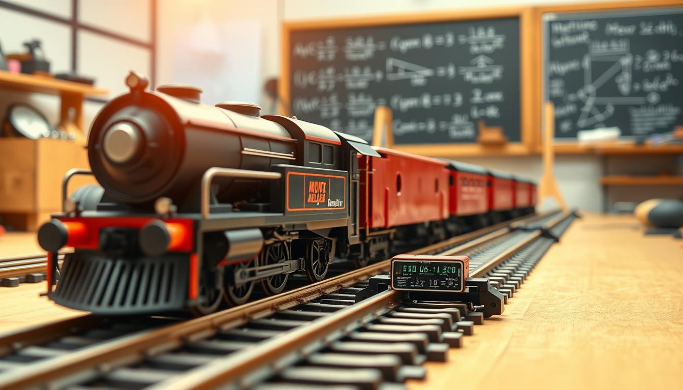
Watching a model train loop an oval might seem like a simple hobby. But, if you look closer, it’s much more. It’s a tiny physics lab, showing us the big forces in action.
This hobby is all about the science of motion. We learn about distance, velocity, and acceleration. It’s not just for fun; it’s real physics.
Velocity is like speed with a story. Acceleration is how fast that story changes.
The math behind it is amazing. The formula s = ut + ½at² tells us where the train will be. It shows us the beauty of motion.
So, forget about just watching the train. You’re actually doing physics. Your train is teaching you about the science of stopping and starting.
Two Timing Gates or Video Analysis Setup
Getting data on your train’s motion isn’t about guessing. It’s about picking the right tool. You have two main ways to look at the same event.
Timing gates are like the photo-finish camera for your railroad. You place two infrared beams a set distance apart. When the train crosses each beam, a timer records the time.
This method is simple and direct. You get two clear data points—time at Gate A and time at Gate B. Then, you can do the math to find the speed.
Video analysis is like being a 21st-century detective. You film the whole run with your smartphone. Then, using free software, you mark the engine’s position frame-by-frame.
This method gives you hundreds of data points. You get a continuous story of the motion. It shows every detail in the speed curve. It’s like writing a biography, not just collecting data.
So, which method do you choose? It depends on what story you want the kinematics to tell.
Let’s look at the two methods:
| Method | Data Type | Setup & Vibe | Best For |
|---|---|---|---|
| Timing Gates | Discrete, two-point | Physical hardware, instant results. Feels like a lab experiment. | Quick, clear measurements of average speed and acceleration over a fixed zone. |
| Video Analysis | Continuous, high-resolution | Software-based, post-processing. Feels like digital forensics. | Seeing the full, unvarnished truth of acceleration, deceleration, and even jerk throughout the run. |
Timing gates are a good starting point. They’re scientific and give quick answers. Video analysis is for those who want to see the whole story. It shows the messy beauty of physics on your layout.
Start with timing gates to learn the basics. Then, move to video analysis. You’ll confirm your numbers and see the whole motion story. This is the heart of kinematics.
Measuring Start/Stop Runs and Plotting v‑t Curves
We set up timing gates and cameras to test our model trains. This is where physics meets the real world. We test how fast and slow the trains can go.
First, we use a straight track without any obstacles. The train starts from a stand-still. Our goal is to see how fast it can go and then stop completely.
There are different ways to collect data. For a simple setup, two infrared timing gates work well. Place one at the start and one at the end. A third gate at the midpoint can measure the train’s speed in the middle.
For a more advanced setup, a smartphone can record at 60 frames per second. This allows for detailed analysis of the train’s movement.
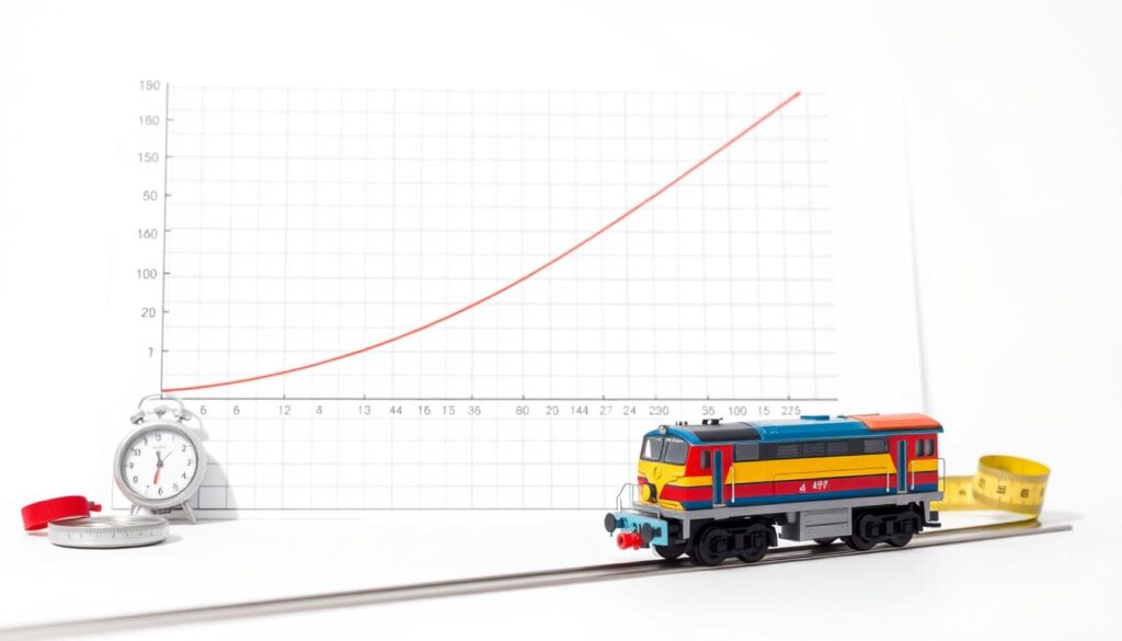
After collecting data, we plot velocity against time. This graph shows the train’s performance. The slope of the graph is key, showing how fast the train accelerates.
A steep slope means the train accelerates quickly. A flat line shows constant speed. A downward slope indicates braking.
This graph tells us how the train moves. It shows if the train accelerates smoothly or brakes suddenly. The v-t curve is like a biography of the train’s run.
Looking at the graph, we learn about dynamics. The initial steep curve shows acceleration. A straight line means constant speed. The final downward curve shows braking.
The area under the curve shows the total distance traveled. This data helps us understand the train’s performance.
Below is a sample data set from a 1:87 scale locomotive. It shows how the velocity changes and the acceleration shifts from positive to negative.
| Time (s) | Position (m) | Velocity (m/s) | Acceleration (m/s²) | Phase |
|---|---|---|---|---|
| 0.0 | 0.00 | 0.00 | 0.75 | Acceleration |
| 0.5 | 0.10 | 0.20 | 0.78 | Acceleration |
| 1.0 | 0.45 | 0.85 | 0.80 | Acceleration |
| 1.5 | 1.01 | 1.10 | 0.75 | Acceleration |
| 2.0 | 1.80 | 1.58 | 0.00 | Constant Velocity |
| 2.5 | 2.33 | 1.58 | 0.00 | Constant Velocity |
| 3.0 | 2.86 | 1.06 | -1.04 | Deceleration |
| 3.5 | 3.10 | 0.48 | -1.16 | Deceleration |
| 4.0 | 3.21 | 0.00 | -0.96 | Deceleration |
This table is more than just numbers. It tells the story of a single run. The positive acceleration phase shows the train getting faster. The constant velocity phase shows control. The negative acceleration phase shows the train stopping smoothly.
This exercise is not just about collecting data. It’s about learning to read the story it tells. A real train engineer manages momentum, as shown by the v-t graph. So, plot your points, draw your line, and listen to what your train is trying to tell you about its performance.
Estimating Acceleration a from slope; distance predictions
Your v-t graph is now a crystal ball. The slope you found is your train’s acceleration. It shows how fast your train goes from 0 to top speed. A steep slope means it’s a quick starter, while a gentle slope is for a slower ride.
This slope is key to predicting your train’s path. It uses the equation s = ut + ½at². This equation is like a time machine. It lets you know how far your train will go if it keeps accelerating at the same rate.
Now, you’re not just watching; you’re planning the future. You can predict where your train will be in seconds or how far it will travel. It’s like having all the data to predict the weather.
You’ve moved from just watching to analyzing. With your acceleration and the equation, you can predict your train’s every move. Your lab is now about making rules, not just collecting data.
Braking Distance vs Speed: The Quadratic Reality
Watching a model train speed down the track, it’s easy to overlook a key physics lesson. Stopping is not the opposite of moving; it’s a unique challenge. When we move from speeding up to slowing down, we face a tough physics rule. The braking distance isn’t just a straight line; it’s a sharp, quadratic jump that separates a safe stop from a crash.
Forget the idea of a straight line. The relationship between speed and stopping distance is complex. Doubling your speed means you need four times more distance to stop. This is the strict law of kinetic energy. Your model train is more than a toy; it’s a physics lesson on rails, showing a principle that real-world engineers must follow.
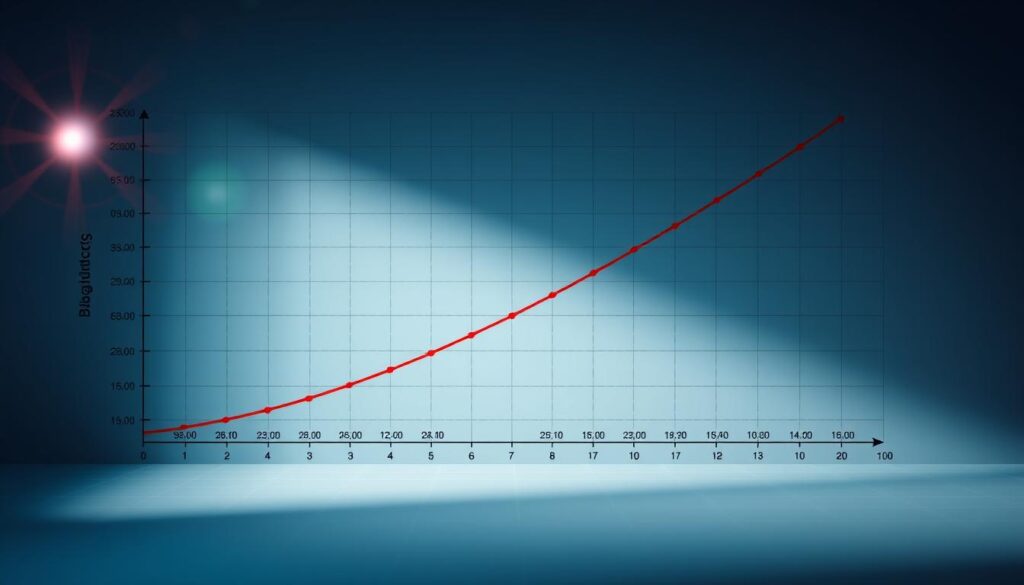
Our experiments, using a simple two-timing-gate setup, clearly show this truth. We tested the same model locomotive at different speeds and measured when it stopped. The data shows a clear quadratic trend.
| Initial Speed (m/s) | Measured Braking Distance (m) | Calculated Stopping Distance (v²/2a)* | Trend |
|---|---|---|---|
| 0.5 | 0.05 | 0.048 | Base |
| 1.0 | 0.20 | 0.191 | 4x base distance |
| 1.5 | 0.45 | 0.430 | 9x base distance |
| 2.0 | 0.80 | 0.764 | 16x base distance |
The table above is more than data; it’s a statement about inertia. The third column, calculated using the stopping distance formula, shows a dramatic increase. The jump from 1.0 to 1.5 m/s is not just a 50% increase in stopping distance—it’s more than double. This is the quadratic relationship in action: distance is proportional to the square of the speed.
Why does this matter? This isn’t just about model train physics. It’s the same quadratic rule that affects freight trains and car following distances. The braking distance equation, d ∝ v², shows that “speed kills” is a kinematic fact. Your model train’s “emergency stop” is a small-scale example of the forces at play in the real world.
So, the next time you see a train—model or massive—remember: the distance it needs to stop isn’t a suggestion from physics. It’s a law. And as our little experiment shows, this law is brutally, quadratically, unforgiving.
Comfort Metric: Jerk (Change of Acceleration) for Passenger Comfort
Ever wondered why some rides feel smooth, while others make you feel queasy? It’s not just about how fast you go. It’s about how you accelerate. This is where jerk comes in—a hidden physics factor that makes all the difference.
Jerk is the rate of change of acceleration. It’s about how quickly your speed changes, and how quickly that change happens. Imagine a train that smoothly picks up speed versus one that suddenly speeds up. One is smooth; the other is jarring.
Modern electric vehicles focus on reducing jerk. They use a “plateau phase” to make acceleration and braking smoother. This phase is a brief moment of constant speed, which makes the ride feel more comfortable. It’s like the difference between a sudden stop and a gentle one.
In your model train lab, you can see jerk in action. Plotting your velocity-time data shows acceleration. But a sudden spike in that slope means high jerk. You can calculate it by looking at how your acceleration changes over time.
Why does jerk matter for a small train? It’s about comfort, not just physics. High jerk feels like a sudden jolt, like when a subway car starts moving. Low jerk is smooth, like a high-speed elevator.
| Scenario | Jerk Profile | Passenger Experience | Model Train Equivalent |
|---|---|---|---|
| High Jerk Start | Sudden, high initial acceleration | Jarring, “lurching” feeling | Full throttle from standstil |
| Low Jerk Start | Gradual, controlled ramp-up | Smooth, almost imperceptible | Controlled voltage ramp |
| High Jerk Stop | Abrupt deceleration | Sudden lurch forward | Instant power cut, no braking curve |
| Low Jerk Stop | Gradual, linear deceleration | Smooth, predictable stop | Regenerative braking simulation |
Jerk isn’t just about comfort; it’s about control. A train engineer is judged on how smooth the ride is, not just how fast they go. By studying jerk in your model train, you’re improving the experience for tiny passengers. So, the next time you watch your train accelerate, think: is this a rocket launch or a luxury cruise? The answer is in the jerk.
Safety Tie‑In: Why real trains need long stopping zones
Ever wonder why trains need miles to stop? Your model railroad lab just answered that question with quadratic equations and a dose of cold reality. That gentle curve on your graph isn’t just academic decoration – it’s the mathematical ghost haunting every railway engineer’s nightmares.
Our miniature experiment reveals an uncomfortable truth: stopping a real train isn’t physics; it’s applied theology. You’re praying the calculations account for everything. The braking distance we measured? That’s just chapter one in a safety manual thicker than a phone book.
Real rail systems add what engineers call a “safety distance” buffer. Think of it as the automotive equivalent of leaving three car lengths – except the car is a skyscraper on wheels. This buffer accounts for the reaction time domino effect: human operator plus computer system plus brake signal traveling through miles of train.
Here’s where our model train’s simplicity meets real-world chaos. Air brakes don’t engage simultaneously along a freight train’s length. The signal propagates car by car – a mechanical wave of slowing that takes seconds. During those seconds, your braking distance is growing while the brakes are waking up.
Fixed-block signaling, the grandfather of rail safety, literally carves this worst-case scenario into the landscape. Blocks of track must be “long enough for the braking distance plus a safety distance.” It’s like playing musical chairs where the chairs are stationary cities and the music is Newton’s laws of motion.
The safety calculus includes variables that would make your lab report blush:
- Wet rails (reducing friction by up to 30%)
- Partial brake failure (because mechanical systems get tired too)
- Grade variations (even slight slopes change everything)
- Temperature effects on steel and air pressure
Your quadratic trend – speed squared equals trouble – gets multiplied by these real-world coefficients. That’s why a passenger train traveling at 80 mph might need over a mile to stop safely. The braking distance isn’t a suggestion; it’s a commandment written in physics and liability law.
Modern systems use moving-block technology that’s more sophisticated, but the principle remains: know your stopping distance, then add margin. Lots of margin. The kind of margin that turns “oops” into “everyone’s fine.”
So when you watch your model train glide to a halt, remember you’re witnessing a scaled-down miracle. The real version involves enough steel to build a small town, enough momentum to rearrange geography, and enough safety buffers to make a statistician weep with joy. That’s why trains need room – because stopping civilization’s heaviest moving objects requires respecting the square in velocity squared.
The next time someone asks why trains can’t stop quickly, show them your graph. Then explain how braking distance grows faster than our intuition, and safety grows even faster than that. It’s not paranoia; it’s the price of moving mountains at speed.
Spreadsheet Template for Calculations
The spreadsheet is where data turns into clear, useful information. It’s like moving from sketching with charcoal to using a GPS map. One is art, the other is engineering.
I’ve created a template to make calculations easier. This way, you can focus on the physics without getting bogged down in math.
Here’s how it works. You enter time data in one column and position in another. Then, a formula calculates velocity. Plotting these values makes the graph appear like magic.
Linear regression is the real magic. It finds the slope of your velocity-time curve. This slope is your acceleration. No need for rulers or guessing.
The final piece is s = ut + 1/2at². This formula is more than a formula; it’s a prediction tool. Enter a time, and it calculates distance. Change the time, and the distance updates instantly.
This automation does more than save time. It uncovers truths. By removing human error, trends become clear. A small curve in braking data? The spreadsheet finds it first.
You can even calculate jerk—the change in acceleration. This shows how motion affects comfort.
The template turns your train’s physics into a dynamic model. It turns a one-time experiment into a living simulation. Test scenarios instantly. See how changes affect stopping distance. The s = ut + 1/2at² formula is your guide.
Think of this as an invitation to work smarter. Download the template, input your data, and watch as data becomes clear evidence. Your lab report will be better. Your grade will likely improve. And you’ll see data in a new light.
Assessment Rubric for Lab Reports
Great science starts with clear communication. This rubric is a guide, not a limit. It helps you turn your kinematics experiment into a story of force and motion.
Data Integrity & Method (The Foundation)
Was your setup solid? We want to see a detailed description of your timing gates or video setup. A good kinematics study relies on reliable data. How did you make sure your timing was accurate? A well-set-up experiment is key.
Analysis & Visualization (The “Aha!” Moment)
Now, let’s see your data come to life. Did you plot those graphs right? And did you correctly find acceleration from the graph’s slope? The real test is explaining how speed and braking distance are linked. Your graph should tell a story, not just show numbers.
Interpretation & Synthesis (The Big Picture)
This is where your report shines. It’s not just about the data. How does your model train relate to the real world? Did you talk about jerk and its effect on comfort? The most important part is linking your model to real-world safety. This shows why trains need long stopping distances.
Clarity & Presentation (The Storyteller’s Art)
Did you use your spreadsheet to tell a story, not just list data? Does your report flow smoothly from start to finish? A great report doesn’t just show kinematics; it explains why it matters. It turns a hobby into a lesson in physics and engineering.
